Mobile App
MindCompanion is the UN's mental health app for peacekeepers. It met Section 508 and had clinical approval. It also felt sterile, and engagement was low. I was brought in to find the missing experience and guide the team to fix it.
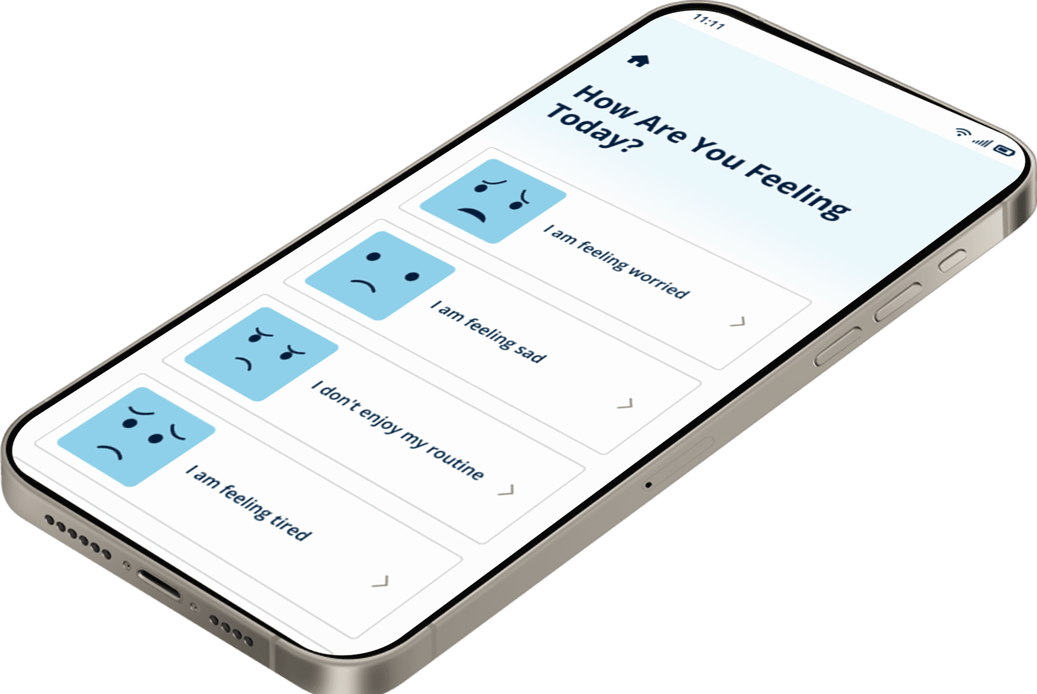
Designing an app experience for release on the app store: usage, activation and launch benchmarks
MY ROLE
Lead UX Designer & Strategist
TIMELINE
3 months
CLIENT
Global IGO (Intergovernmental Organization)
PLATFORM
Native Mobile App and Desktop
My Role
Lead Product Designer
Evaluated an approved app and recommended how to fix the experience
Guided a senior designer and a team of 4 designers
Presented to design and engineering first, then to both sponsors for approval
Built the journey map, competitive matrix, and KPI benchmarks
Wrote contextual survey messaging with a copywriter
Peacekeepers workspace puts them in the middle ofcrisis conditions, far from home. The UN-Mindcompanion app was built to help them check in on their own mental health and find support.
The design was approved, the release date was set, and the digital experience was built . The user experience was the last thing to be considered. No benchmarks for success, no user testing, and more glaringly I heard that it didn't feel right.
Peacekeepers should feel accompanied when they they open the app, more like a buddy experience rather than an assessment.
— United Nations Product team, (sentiment on;y)

Problem
UX makes the difference between completing a course and healing mental health.
Approved
Section 508 - Requirement
Approved
Clinical review
Approved
Product Design
Fail
UX Design
Missing
User Testing
Missing
Benchmark Metrics
Three moves I made when the answer was NO
Filed research access denied
The Challenge
I asked to add questions to the team's on-site peacekeeper interviews and to see the results. The request was denied, and I was asked why I wanted it.
I built the journey map another way. I used peacekeeper journals and YouTube day-in-the-life videos, then mapped each app screen against a timeline from the footage.
Demonstrated
Resistance to changing the daily survey
The Challenge
The daily survey pattern was already approved. The team resisted reopening it, and the clock made every change expensive.
I stopped arguing from opinion and I showed examples from competing apps handling the same or similar inderatcions. The examples carried it, and the usability fix was approved.
Demonstrated
Locked design tokens
The Challenge
I proposed clearer button states and text tokens for visibility. The design team declined. The tokens had already been through approval.
I let it go and worked inside their system. I spent my effort where approval was still possible: messaging, the download sequence, and the assessment page.
Demonstrated
What I Owned
What shipped. What didn't… and Why
01
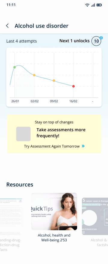
Contextual survey messages
The message changes when results improve, plateau, or worsen. Written with a copywriter.
02
Stepped packages with pause and start. I added a short animated story and storage warnings for older devices.
03
Stepped packages with pause and start. I added a short animated story and storage warnings for older devices.
04
Resisted at first. Won with competitor examples.
05
Not built. The lead sponsor asked me to leave a full strategy and map.
06
Judged too big of a stretch for a first release.
07
The design team would not reopen tokens that were already approved.
Shipped
A check-in that answers like a buddy
The check-in gave a wellness score. It didn't respond to how the user was actually doing.
I designed three response states so that a setback gets a next step, not a red number.
Logic for Messaging
Encourageing tone, plus a badge
Supportive and confident. Progress is not always a line going up.
Resilient tone and one clear next step.
Prototype Design
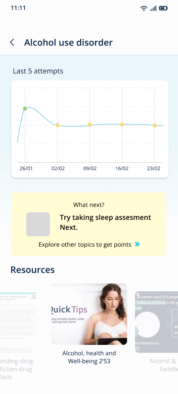
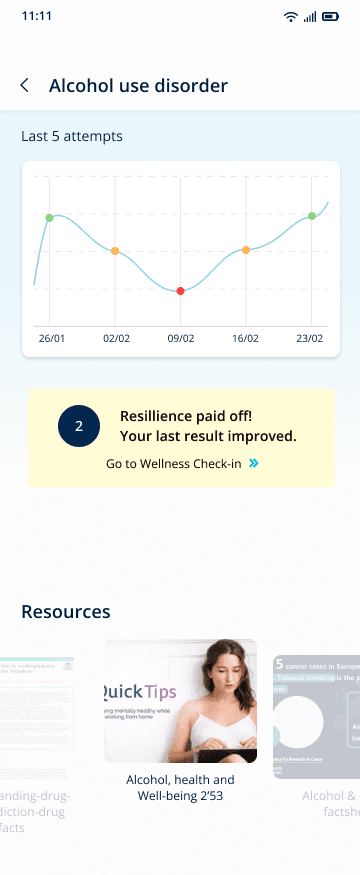
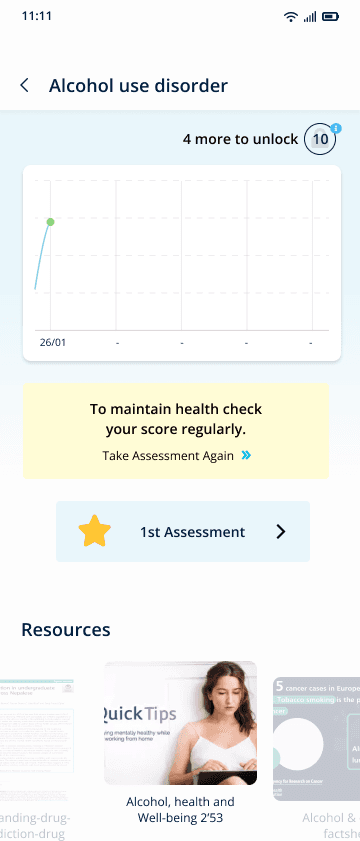
Recommended core UX Improvements to the workflow
Notification fatigue: An app reliant on generic push notifications to keep users active will be uninstalled.
Prototype Design
BEFORE
Clinical flow: ❶ Home → ❷ Wellness Checkin → ❸ Assessment screen
Guided Onboarding screen
1
Sign-In
2
Downloads
3
Home
Watch “Get Started” Video
Complete Content
4
Wellness
Checkin
Color coded result
Take
Assessment
What’s on your mind?
Resources
Screen
Choose content
Relies solely on notification to engage users to return to app.
Typical self-paced course — 5%* content completion
(* widely cited completion rate )
AFTER
Gamified flow: ❶ Home → ❷ Wellness Checkin → ❸ Content Cycle
proposed camification layer = motivate repeat usage & longer visits
Guided Onboarding screen
1
Sign-In
Check updates
2
Home
Watch “Get Started” Video
3
Downloads
Get Latest Updates
Progressive Learning & Healing
4
Wellness
Checkin
Color coded result
Suggest
Category
Assessment
Screen
Resources
Screen
Conditional Message → Recommended Content
Gamification Features - support activation, build Confidence & Security
Typical course + gamification - 13%** content completion
(**research informed proxy)
Clear task
Add clear contextual call-to-action on each screen
Motivation loop
Reward behavior beyond a good check-in score
Responsive
Contextually respond to user
Build the evidence from scratch


Product Stategy
Defining the impact is the key behind recognizing a successful feature
Vision of an outstanding app experience.
Being that no one owned what successful benchmarks, I took the initiative to provide "what a successful app launch would look like?"
I built KPIs based on reliable industry proxy metrics, based on the specifics of the launch.
"The average person uses 30 apps per month.
The average smartphone user has 80 apps on their phone, this means that
more than 62% of those apps don't get used every month."
Benchmarks • Design provenance
Installs
29%
60% lift for prestigious institution
Based users viewing App listing of credible medical developer
Downloads
100 - 500
first 30-days
Based on organic launch strategy no ad budget
Usage
28 - 84
Days before 1st usage
Based on App developer and completion level of category
content completion
13%
first 30-days
Typical self-paced course with gamified content.
Source: App Screenshot Studio
Source: Journal of Medical Internet research
Factors Impacting App Store Experience
What I did not own
What I owned
Outcome
It launched. I can't claim the result.
July
2024
Public launch as UN's MindCompanion on the App Store and Google Play.
My contract ended before the launch. I have no confirmed view of what shipped in the public release, and no usage data.
Usability testing was scoped as optional in my proposal. It was never run. Nothing on this page is a measured result.
A later review of the project design file showed my work survived in part.
Conditional Messages
Kept
The three-state logic is still there.
Trade Off
The human tone. The copy grew longer and more clinical.
Download sequence
Kept
Stepped packages with pause and start.
Trade Off
The story elements and the device storage warnings.
Assessment page
Kept
The button styling I proposed.
Trade Off
Clarity. It still doesn't read as “choose an assessment.”
SKILLS DEMONSTRATED
UX Strategy
Design Taste, Problem-Solution Fit
Design Investigation
Evidence, Research, Synthesis
Design Systems
Behavior Design, System Design
Native Mobile App
Constraiints
Stakeholder Collab
Storytelling, Tradeoffs
Team Lead
Presentation, Team Guidance